


この記事では、SEOタイムズのデザイナーが様々なCSSを使った見出しデザインを作成し、ユーザーの皆様にご紹介させていただきます。
全てソースコードも記載しており、コピペで使用することができますので好みの見出しデザインを見つけてください!
効果的な見出しデザインは、ユーザーの視覚的な満足感を高めるだけでなく、SEOにも大きな影響を与えます。
見出しタグ(h1, h2など)を適切に使うことで、検索エンジンはページの構造をより正確に理解しやすくなり、コンテンツの評価が向上します。
また、視覚的に優れた見出しデザインは、ユーザーの滞在時間を延ばす効果があり、結果としてSEOにおいて重要なランキング要素であるユーザーエクスペリエンスの改善にもつながります。

- 目次
見出しデザインを表示・アレンジする方法
見出しデザインを作成するためには、基本的にHTMLとCSSを使用します。
まずCSS初心者に向けて、この記事で紹介する見出しデザインを表示する方法とアレンジ方法をご紹介します。
HTML/CSSをよくご存じの方は、次のセクションから見出しデザイン集を掲載しておりますので、そちらをご覧ください。
見出しデザインを表示させる方法
① HTMLをコピペする
紹介しているHTMLをコピーして、見出しを挿入したい箇所にペーストします。
② CSSをコピペする
HTML同様にコピーし、CSSを記述する場所にペーストしてください。
CSSを記述する場所は、サイト・管理方法によって異なります。
例)style.css、ページ内に直接入力など
③ レイアウトを調整する
基本的にコピペで使用できますが、サイトの状況によってはデザインが崩れる場合がありますので、必ず確認を行ってください。
見出しデザインをアレンジする方法
色を変えたい
基本的には、コピーしたCSS記述のカラーコード(#○○○○○○)を変更すれば色が変わります。
好みのカラーコードを探して、変更してみましょう。
カラーコードはこちらから探すことができます。
角を丸くしたい
四角形の角を丸くしたい場合、「border-radius」を使います。コピペしたCSSにborder-radius: 10px;と記述してみましょう。
すると以下のように変化します。
今回ご紹介する見出しデザインテンプレートを活用して、好みのデザインを作成してみましょう!

もちろん、そのまま使うのもOKですよ!
線を使った見出しデザイン8選
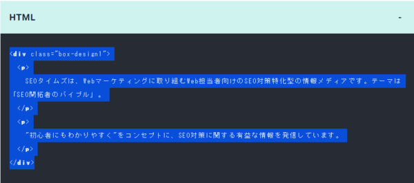
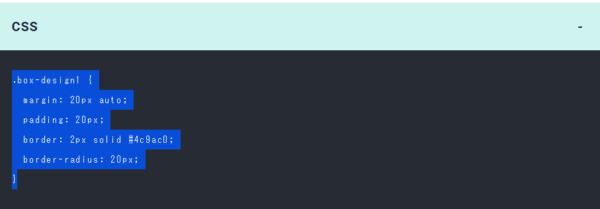
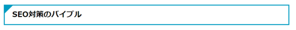
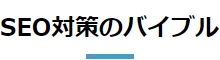
1 SEOタイムズのデザイン

HTML
<h2 class="ttl_line1">SEO対策のバイブル</h2>CSS
.ttl_line1 {
font-weight: bold;
border-left: 5px solid #4c9ac0;
border-bottom: 2px dashed #B4B4B4;
padding: 0.25em 0 0.3em 0.5em;
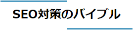
}2 1文字目にアクセントのあるデザイン

HTML
<h2 class="ttl_line2">SEO対策のバイブル</h2>CSS
.ttl_line2 {
  font-weight: bold;
  border-bottom: 2px solid #4c9ac0;
  padding: 0.3em;
  margin-bottom: 0.3em;
}
.ttl_line2:first-letter {
  font-size: 1.5em;
  color: #4c9ac0;
}
3 2色の下線デザイン

HTML
<h2 class="ttl_line3">SEO対策のバイブル</h2>CSS
.ttl_line3 {
  font-weight: bold;
  border-bottom: 3px solid #e3e3e3;
  padding: 0.3em;
  margin-bottom: 0.3em;
  position: relative;
}
.ttl_line3::after {
  content: '';
  background-color: #4c9ac0;
  width: 2em;
  height: 3px;
  position: absolute;
  bottom: -3px;
  left: 0;
  z-index: 1;
}
4 下線にアクセントのあるデザイン

HTML
<h2 class="ttl_line4">SEO対策のバイブル</h2>CSS
.ttl_line4 {
  font-weight: bold;
  border-bottom: 3px solid #4c9ac0;
  padding: 0.3em;
  margin-bottom: 0.3em;
  transform: skewX(-15deg);
  position: relative;
}
.ttl_line4::before, .ttl_line4::after {
  content: '';
  background-color: #4c9ac0;
  width: 3px;
  height: 20px;
  transform: rotate(30deg);
  position: absolute;
  bottom: -10px;
}
.ttl_line4::before {
  right: 2.5em;
}
.ttl_line4::after {
  right: 2em;
}
5 ストライプ下線デザイン

HTML
<h2 class="ttl_line5">SEO対策のバイブル</h2>CSS
.ttl_line5 {
  font-weight: bold;
  padding: 0.3em;
  margin-bottom: 0.3em;
  position: relative;
}
.ttl_line5::after {
  content: '';
  background-size: 10px 10px;
  background-color: #e1eef5;
  background-image: repeating-linear-gradient(-45deg, #4c9ac0 0, #4c9ac0 3px, #fff 0, #fff 50%);
  width: 100%;
  height: 7px;
  position: absolute;
  bottom: -5px;
  left: 0;
}
6 短い下線デザイン

HTML
<h2 class="ttl_line6">SEO対策のバイブル</h2>CSS
.ttl_line6 {
  font-weight: bold;
  padding: 0.5em 0.3em;
  margin-bottom: 0.3em;
  position: relative;
}
.ttl_line6::before {
  content: '';
  background-color: #4c9ac0;
  width: 2em;
  height: 3px;
  position: absolute;
  bottom: 0;
  left: 0;
}
7 2本線のデザイン

HTML
<h2 class="ttl_line7">SEO対策のバイブル</h2>CSS
.ttl_line7 {
font-weight: bold;
padding: 0.3em 0.5em;
border-left: 10px double #4c9ac0;
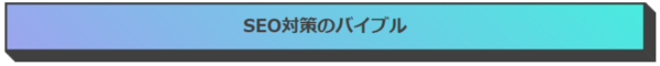
}8 グラデーションの下線デザイン

HTML
<h2 class="ttl_line8">SEO対策のバイブル</h2>CSS
.ttl_line8 {
  position: relative;
  padding: 0.3em 0.5em;
}
.ttl_line8::after {
  position: absolute;
  bottom: 0;
  left: 0;
  width: 100%;
  height: 5px;
  content: '';
  border-radius: 2px;
  background-image: -webkit-gradient(linear, right top, left top, from(#9ca5ee), to(#49ebdf));
  background-image: -webkit-linear-gradient(right, #9ca5ee 0%, #49ebdf 100%);
  background-image: linear-gradient(to left, #9ca5ee 0%, #49ebdf 100%);
}
9 左側のボーダーが2色のデザイン

HTML
<h2 class="ttl_line9">SEO対策のバイブル</h2>CSS
.ttl_line9 {
  background-image: linear-gradient(#84dfef 50%, #3a7c9d 50%);
  background-size: 8px 100%;
  background-repeat: no-repeat;
  padding-left: 18px;
}
枠で囲む見出しデザイン8選
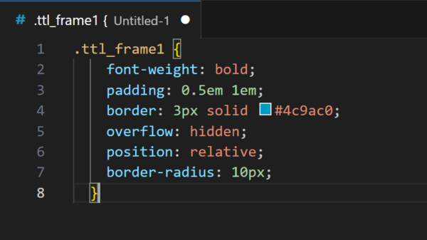
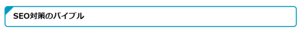
1 左上にアクセントのあるデザイン

HTML
<h2 class="ttl_frame1">SEO対策のバイブル</h2>CSS
.ttl_frame1 {
  font-weight: bold;
  padding: 0.5em 1em;
  border: 3px solid #4c9ac0;
  overflow: hidden;
  position: relative;
}
.ttl_frame1::before {
  content: '';
  position: absolute;
  left: 0;
  top: 0;
  border-width: 25px 25px 0 0;
  border-style: solid;
  border-color: #4c9ac0 #fff #4c9ac0;
}
2 左ストライプデザイン

HTML
<h2 class="ttl_frame2">SEO対策のバイブル</h2>CSS
.ttl_frame2 {
  font-weight: bold;
  border: 3px solid #4c9ac0;
  padding: 0.5em 1em 0.5em calc(1em + 10px);
  position: relative;
}
.ttl_frame2::before {
  content: '';
  background-color: #4c9ac0;
  background: repeating-linear-gradient( -45deg, #4c9ac0, #4c9ac0 5px, #ffffff 5px, #ffffff 10px );
  width: 20px;
  height: 100%;
  position: absolute;
  top: 0;
  left: 0;
  z-index: -1;
}
3 上下の枠デザイン

HTML
<h2 class="ttl_frame3">SEO対策のバイブル</h2>CSS
.ttl_frame3 {
  font-weight: bold;
  padding: 0.5em 1em;
    --x-gradient: linear-gradient(90deg, #4c9ac0 0 100%);
    --y-gradient: linear-gradient(#4c9ac0 0 15px, transparent 0 calc(100% - 15px), #4c9ac0 calc(100% - 15px));
  background-image:var(--x-gradient), var(--y-gradient), var(--x-gradient), var(--y-gradient);
  background-repeat: no-repeat;
  background-size: 100% 3px, 3px 100%, 100% 3px, 3px 100%;
  background-position: top, right, bottom, left;
  position: relative;
}
4 左右の枠デザイン

HTML
<h2 class="ttl_frame4">SEO対策のバイブル</h2>CSS
.ttl_frame4 {
  font-weight: bold;
  padding: 0.5em 1em;
  position: relative;
}
.ttl_frame4::before, .ttl_frame4::after {
  content:'';
  width: 10px;
  height: calc(100% - 6px);
  position: absolute;
  top: 0;
}
.ttl_frame4::before {
  border-left: solid 3px #4c9ac0;
  border-top: solid 3px #4c9ac0;
  border-bottom: solid 3px #4c9ac0;
  left: 0;
}
.ttl_frame4::after {
  content: '';
  border-top: solid 3px #4c9ac0;
  border-right: solid 3px #4c9ac0;
  border-bottom: solid 3px #4c9ac0;
  right: 0;
}
5 背景をずらしたデザイン

HTML
<h2 class="ttl_frame5">SEO対策のバイブル</h2>CSS
.ttl_frame5 {
  font-weight: bold;
  border: 3px solid #4c9ac0;
  background-color: #fff;
  padding: 0.5em 1em;
  position: relative;
}
.ttl_frame5::after {
  content: '';
  background-color: #4c9ac0;
  width: 100%;
  height: 100%;
  position: absolute;
  top: 0;
  left: 0;
  z-index: -1;
  transform: rotate(-1deg);
}
6 ノート風デザイン

HTML
<h2 class="ttl_frame6">SEO対策のバイブル</h2>CSS
.ttl_frame6 {
  font-weight: bold;
  padding: 0 0.5em;
  margin-left: 0.5em;
  margin-right: 0.5em;
  border-left: 7px dotted #4c9ac0;
  background-color: #fff;
  outline: 3px solid #4c9ac0;
  outline-offset: 0.5em;
  position: relative;
}
.ttl_frame6::after {
  content: '';
  position: absolute;
  right: calc(-0.5em - 3px);
  top: calc(-0.5em - 3px);
  border-width: 0 20px 20px 0;
  border-style: solid;
  border-color: #4c9ac0 #fff #4c9ac0;
  box-shadow: -1px 1px 1px rgba(0, 0, 0, 0.15);
}
7 ステッチのデザイン

HTML
<h2 class="ttl_frame7">SEO対策のバイブル</h2>CSS
.ttl_frame7 {
  font-weight: bold;
  padding: 0.5em 1em;
  margin-left: 5px;
  margin-right: 5px;
  border-right: 3px dashed #4c9ac0;
  border-bottom: 3px dashed #4c9ac0;
  outline: 3px solid #4c9ac0;
  outline-offset: 5px;
}
8 柄を入れたデザイン

HTML
<h2 class="ttl_frame8">SEO対策のバイブル</h2>CSS
.ttl_frame8 {
  font-weight: bold;
  padding: 0.5em 1em;
  margin-left: 5px;
  margin-right: 5px;
  outline: 3px solid #4c9ac0;
  outline-offset: 5px;
  background: linear-gradient(-45deg, transparent 0 20px, #fff 20px calc(100% - 20px), transparent calc(100% - 20px)),
              repeating-linear-gradient(-45deg, #4c9ac0 0 2px, #fff 2px 6px);
}
背景のある見出しデザイン9選
1 背景とラインのデザイン

HTML
<h2 class="ttl_background1">SEO対策のバイブル</h2>CSS
.ttl_background1 {
  font-weight: bold;
  background-color: #4c9ac0;
  color: #fff;
  padding: 0.5em 1em calc(0.5em - 6px);
  position: relative;
}
.ttl_background1::after {
  content: '';
  background-color: #4c9ac0;
  width: 100%;
  height: 3px;
  position: absolute;
  bottom: -6px;
  left: 0;
}
2 角がめくれたデザイン

HTML
<h2 class="ttl_background2">SEO対策のバイブル</h2>CSS
.ttl_background2 {
  font-weight: bold;
  padding: 0.5em 1em;
  background-color: #e1eef5;
  position: relative;
}
.ttl_background2::after {
  content: '';
  position: absolute;
  right: 0;
  top: 0;
  border-width: 0 20px 20px 0;
  border-style: solid;
  border-color: #4c9ac0 #fff #4c9ac0;
  box-shadow: -1px 1px 1px rgba(0, 0, 0, 0.15);
}
3 背景が2色のデザイン 1

HTML
<h2 class="ttl_background3">SEO対策のバイブル</h2>CSS
.ttl_background3 {
  font-weight: bold;
  padding: 0.5em 1em;
  background-color: #4c9ac0;
  color: #fff;
  overflow: hidden;
  position: relative;
}
.ttl_background3::after {
  content: '';
  background-color: #fff;
  opacity: 0.3;
  transform: rotate(-65deg);
  position: absolute;
  bottom: -250px;
  right: -250px;
  width: 300px;
  height: 500px;
}
4 背景が2色のデザイン 2

HTML
<h2 class="ttl_background4">SEO対策のバイブル</h2>CSS
.ttl_background4 {
  font-weight: bold;
  padding: 0.5em 1em;
  border: 3px solid #4c9ac0;
  background-image: linear-gradient(45deg, #fff 0 10%, #4c9ac0 10%);
  -webkit-background-clip: text;
  color: transparent;
  position: relative;
}
.ttl_background4:before {
  position: absolute;
  top: 0;
  left: 0;
  width: 100%;
  height: 100%;
  background: linear-gradient(45deg, #4c9ac0 10%, #fff 0 10%);
  content: '';
  z-index: -1;
}
5 斜めのデザイン

HTML
<h2 class="ttl_background5">SEO対策のバイブル</h2>CSS
.ttl_background5 {
  font-weight: bold;
  padding: 0.5em 1em;
  color: #fff;
  position: relative;
}
.ttl_background5::before {
  content: '';
  position: absolute;
  top: 0;
  left: 0;
  width: 100%;
  height: 100%;
  background: #4c9ac0;
  transform: skew(-20deg);
  z-index: -1;
}
.ttl_background5::after {
  content: '';
  position: absolute;
  border-left: 20px double #fff;
  height: 100%;
  top: 0;
  right: 50px;
  transform: skew(-20deg);
}
6 ステッチのデザイン

HTML
<h2 class="ttl_background6">SEO対策のバイブル</h2>CSS
.ttl_background6 {
  font-weight: bold;
  padding: 0.5em 1em;
  margin-left: 10px;
  margin-right: 10px;
  background-color: #b2d3e4;
  box-shadow: 0 0 0 10px #b2d3e4;
  border-top: 2px dashed #fff;
  border-bottom: 2px dashed #fff;
}
7 背景がグラデーションのデザイン

HTML
<h2 class="ttl_background7">SEO対策のバイブル</h2>CSS
.ttl_background7 {
  padding: 0.3em 0.5em;
  color: #fff;
  background-image: -webkit-gradient(linear, left top, right top, from(#9ca5ee), to(#49ebdf));
  background-image: -webkit-linear-gradient(left, #9ca5ee 0%, #49ebdf 100%);
  background-image: linear-gradient(to right, #9ca5ee 0%, #49ebdf 100%);
}
8 背景がグラデーションで斜めのデザイン

HTML
<h2 class="ttl_background8">SEO対策のバイブル</h2>CSS
.ttl_background8 {
  padding: 0.3em 0.5em;
  color: #fff;
  -webkit-transform: skew(-15deg);
  transform: skew(-15deg);
  background-image: -webkit-gradient(linear, left top, right top, from(#9ca5ee), to(#49ebdf));
  background-image: -webkit-linear-gradient(left, #9ca5ee 0%, #49ebdf 100%);
  background-image: linear-gradient(to right, #9ca5ee 0%, #49ebdf 100%);
}
9 背景色が2色のデザイン

HTML
<h2 class="ttl_background9">SEO対策のバイブル</h2>CSS
.ttl_background9 {
  background: -webkit-linear-gradient(#89cac7 50%, #6ab4ba 50%);
  background: linear-gradient(#89cac7 50%, #6ab4ba 50%));
  color: #fff;
  padding: 0.3em 0.5em;
}
立体間のある見出しデザイン10選
1 枠と影のデザイン

HTML
<h2 class="ttl_3d1">SEO対策のバイブル</h2>CSS
.ttl_3d1 {
  font-weight: bold;
  border: 3px solid #4c9ac0;
  padding: 0.5em 1em;
  box-shadow: 5px -5px #4c9ac0;
}
2 背景と影のデザイン

HTML
<h2 class="ttl_3d2">SEO対策のバイブル</h2>CSS
.ttl_3d2 {
  padding: 0.5em 1em;
  background-color: #e1eef5;
  box-shadow: 5px -5px #4c9ac0;
  position: relative;
}
3 背景をずらしたデザイン

HTML
<h2 class="ttl_3d3">SEO対策のバイブル</h2>CSS
.ttl_3d3 {
  font-weight: bold;
  border: 3px solid #4c9ac0;
  padding: 0.5em 1em;
  position: relative;
}
.ttl_3d3::after {
  content: '';
  background-color: #e1eef5;
  width: calc(100% + 3px);
  height: calc(100% + 3px);
  position: absolute;
  top: -7px;
  left: 4px;
  z-index: -1;
}
4 線をずらしたデザイン

HTML
<h2 class="ttl_3d4">SEO対策のバイブル</h2>CSS
.ttl_3d4 {
  padding: 0.5em 1em;
  box-shadow: 6px -6px #4c9ac0;
  outline: 3px solid #fff;
  border: 3px solid #4c9ac0;
  position: relative;
}
5 影を柄にしたデザイン

HTML
<h2 class="ttl_3d5">SEO対策のバイブル</h2>CSS
.ttl_3d5 {
  border: 3px solid #4c9ac0;
  background-color: #fff;
  padding: 0.5em 1em;
  position: relative;
}
.ttl_3d5::before {
  content: '';
  width: 100%;
  height: 100%;
  background-image: radial-gradient(#4c9ac0 8%, transparent 16%), radial-gradient(#4c9ac0 8%, transparent 16%);
  background-position: 0 0, 7px 7px;
  background-size: 12px 12px;
  position: absolute;
  top: -10px;
  left: 10px;
  z-index: -1;
}
6 ボックスのようなデザイン

HTML
<h2 class="ttl_3d">SEO対策のバイブル</h2>CSS
.ttl_3d {
  font-weight: bold;
  padding: 0.5em 1em;
  border: 3px solid #4c9ac0;
  position: relative;
}
.ttl_3d::before, .ttl_3d::after {
  position: absolute;
  border: solid #4c9ac0;
  content: '';
}
.ttl_3d::before {
  top: -10px;
  right: -16px;
  width: 10px;
  height: 100%;
  border-width: 2px 3px 4px 0px;
  transform: skewY(-45deg);
}
.ttl_3d::after {
  top: -16px;
  left: 4px;
  width: 100%;
  height: 10px;
  border-width: 3px 2px 0px 4px;
  transform: skewX(-45deg);
}
7 下に影があるデザイン

HTML
<h2 class="ttl_3d17">SEO対策のバイブル</h2>CSS
.ttl_3d17 {
  background: #4c9ac0;
  box-shadow: 0 10px 10px -5px rgba(0, 0, 0, .35);
  color: #fff;
  font-weight: bold;
  padding: 0.3em 0.5em;
}
8 ボックスが浮いているような影のあるデザイン

HTML
<h2 class="ttl_3d18">SEO対策のバイブル</h2>CSS
.ttl_3d18 {
  background: #4c9ac0;
  color: #fff;
  font-weight: bold;
  position: relative;
  padding: 0.3em 0.5em;
  text-align: center;
}
.ttl_3d18::before {
  border-radius: 200px / 10px;
  box-shadow: 0 50px 20px rgba(0, 0, 0, .35);
  bottom: 10px;
  content: '';
  position: absolute;
  left: 0;
  width: 100%;
  height: 10px;
}
9 両側がめくれているような影のあるデザイン

HTML
<h2 class="ttl_3d18">SEO対策のバイブル</h2>CSS
.ttl_3d19 {
  background-color: #4c9ac0;
  color: #fff;
  font-weight: bold;
  position: relative;
  padding: 0.3em 0.5em;
  text-align: center;
}
.ttl_3d19::before,.ttl_3d19::after {
  position: absolute;
  bottom: 30px;
  width: 20%;
  height: 7px;
  background: transparent;
  box-shadow: 0 25px 20px rgba(0, 0, 0, .8);
  content: "";
  z-index: -1;
}
.ttl_3d19::before {
  transform: rotate(-5deg);
  left: 5px;
}
.ttl_3d19::after {
  transform: rotate(5deg);
  right: 5px;
}
10 グラデーションのボックスに影のあるデザイン
HTML
<h2 class="ttl_3dl10">SEO対策のバイブル</h2>CSS
.ttl_3dl10 {
  background-image: linear-gradient(45deg, #9ca5ee 0%, #49ebdf 100%);
  border: 3px solid #404040;
  color: #404040;
  font-weight: bold;
  position: relative;
  padding: 0.5em;
  text-align: center;
}
.ttl_3dl10::before,.ttl_3dl10::after {
  background: #404040;
  border: 3px solid #404040;
  content: '';
  position: absolute;
}
.ttl_3dl10::before {
  top: 4px;
  right: -17px;
  width: 8px;
  height: 100%;
  transform: skewY(45deg);
}
.ttl_3dl10::after {
  bottom: -17px;
  left: 4px;
  width: 100%;
  height: 8px;
  transform: skewX(45deg);
}
吹き出しの見出しデザイン5選
1 背景吹き出しデザイン

HTML
<h2 class="ttl_balloon1" data-text="SEO対策のバイブル">SEO対策のバイブル</h2>CSS
<video src="動画の.ttl_balloon1 {
  font-weight: bold;
  padding: 0.5em 1em;
  background-color: #4c9ac0;
  color: #fff;
  position: relative;
}
.ttl_balloon1:before {
  content: '';
  height: 0;
  width: 0;
  border: solid transparent;
  position: absolute;
  left: 30px;
  top: 100%;
  border-color: transparent;
  border-top-color: #4c9ac0;
  border-right-color: #4c9ac0;
  border-width: 6.5px;
}ファイル名"></video>
2 影のある吹き出しデザイン

HTML
<h2 class="ttl_balloon2">SEO対策のバイブル</h2>CSS
.ttl_balloon2 {
  font-weight: bold;
  padding: 0.5em 1em;
  border: 3px solid #4c9ac0;
  box-shadow: 3px 3px 0 0 #4c9ac0;
  position: relative;
}
.ttl_balloon2::before, .ttl_balloon2::after {
  content: '';
  height: 0;
  width: 0;
  border: solid transparent;
  position: absolute;
  left: 30px;
}
.ttl_balloon2::before {
  border-color: transparent;
  border-top-color: #4c9ac0;
  border-right-color: #4c9ac0;
  border-width: 10px;
  top: 100%;
  left: 26px;
}
.ttl_balloon2::after {
  border-color: transparent;
  border-top-color: #fff;
  border-right-color: #fff;
  border-width: 6.5px;
  top: 99%;
}
3 線の吹き出しデザイン 1

HTML
<h2 class="ttl_balloon3">SEO対策のバイブル</h2>CSS
.ttl_balloon3 {
  font-weight: bold;
  padding: 0.3em 1em 0.5em;
  border-radius: 0 0 0 10px;
  border-left: 3px solid #4c9ac0;
  border-bottom: 3px solid #4c9ac0;
  position: relative;
}
.ttl_balloon3::before, .ttl_balloon3:after {
  content: '';
  height: 0;
  width: 0;
  border: solid transparent;
  position: absolute;
  left: 30px;
}
.ttl_balloon3::before {
  border-color: transparent;
  border-top-color: #4c9ac0;
  border-right-color: #4c9ac0;
  border-width: 10px;
  top: 100%;
  left: 26px;
}
.ttl_balloon3:after {
  border-color: transparent;
  border-top-color: #fff;
  border-right-color: #fff;
  border-width: 6.5px;
  top: 99%;
}
4 線の吹き出しデザイン 2

HTML
<h2 class="ttl_balloon4">SEO対策のバイブル</h2>CSS
.ttl_balloon4 {
  font-weight: bold;
  border: 3px solid #4c9ac0;
  padding: 0.5em 1em;
  border-radius: 10px;
  margin-bottom: 10px;
  position: relative;
}
.ttl_balloon4::before {
  content: '';
  background-color: #fff;
  width: 20px;
  height: 3px;
  position: absolute;
  left: 30px;
  bottom: -3px;
}
.ttl_balloon4::after {
  content: '';
  background-color: #4c9ac0;
  width: 20px;
  height: 3px;
  transform: rotate(50deg);
  position: absolute;
  left: 25px;
  bottom: -10px;
}
5 線の吹き出しデザイン③

HTML
<h2 class="ttl_balloon5">SEO対策のバイブル</h2>CSS
.ttl_balloon5 {
  font-weight: bold;
  border-bottom: 3px solid #4c9ac0;
  padding: 0.3em;
  margin-bottom: 10px;
  position: relative;
}
.ttl_balloon5::before {
  content: '';
  background-color: #fff;
  width: 20px;
  height: 3px;
  position: absolute;
  left: 30px;
  bottom: -3px;
}
.ttl_balloon5::after {
  content: '';
  background-color: #4c9ac0;
  width: 20px;
  height: 3px;
  transform: rotate(50deg);
  position: absolute;
  left: 25px;
  bottom: -10px;
}
中央寄せの見出しデザイン5選
1 短い下線のデザイン
HTML
<h2 class="ttl_center1">SEO対策のバイブル</h2>CSS
.ttl_center1 {
  font-weight: bold;
  padding-bottom: 0.5em;
  text-align: center;
  position: relative;
}
.ttl_center1::after {
  content: '';
  background-color: #4c9ac0;
  width: 2em;
  height: 5px;
  position: absolute;
  bottom: 0;
  left: 50%;
  transform: translateX(-50%);
  -webkit-transform: translateX(-50%);
  -ms-transform: translateX(-50%);
}
2 2色の短い下線デザイン
HTML
<h2 class="ttl_center2">SEO対策のバイブル</h2>CSS
.ttl_center2 {
  font-weight: bold;
  padding-bottom: 0.5em;
  text-align: center;
  position: relative;
}
.ttl_center2::before, .ttl_center2::after {
  content: '';
  position: absolute;
  margin:auto;
  left: 0;
  bottom: 0;
  width: 2em;
  background-color: #e3e3e3;
  height: 5px;
  right: 2em;
}
.ttl_center2::before {
  background-color:#4c9ac0;
  left:2em;
  width:4em;
}
3 丸をあしらったデザイン
HTML
<h2 class="ttl_center3">SEO対策のバイブル</h2>CSS
.ttl_center3 {
  font-weight: bold;
  padding-bottom: 0.7em;
  text-align: center;
  position: relative;
}
.ttl_center3::after {
  content: '';
  position: absolute;
  border-bottom: 10px dotted #4c9ac0;
  width: 50px;
  bottom: 0;
  left: 50%;
  transform: translateX(-50%);
  -webkit-transform: translateX(-50%);
  -ms-transform: translateX(-50%);
}
4 左右に線をあしらったデザイン

HTML
<h2 class="ttl_center4">SEO対策のバイブル</h2>CSS
.ttl_center4 {
  font-weight: bold;
  padding: 0 3em;
  width: fit-content;
  margin: 0 auto;
  text-align: center;
  position: relative;
}
.ttl_center4::before, .ttl_center4::after {
  content: '';
  background: #4c9ac0;
  width: 2em;
  height: 3px;
  position: absolute;
  top: 50%;
  transform: translateY(-50%);
  -webkit-transform: translateY(-50%);
  -ms-transform: translateY(-50%);
}
.ttl_center4::before {
  left: 0;
}
.ttl_center4::after {
  right: 0;
}
5 上下に線をあしらったデザイン
HTML
<h2 class="ttl_center5">SEO対策のバイブル</h2>CSS
.ttl_center5 {
  font-weight: bold;
  width: fit-content;
  margin: auto;
  padding: 0.5em 1em;
  margin-bottom: 0.3em;
  text-align: center;
  position: relative;
}
.ttl_center5::before, .ttl_center5::after {
  content: '';
  background-color: #4c9ac0;
  width: 50%;
  height: 3px;
  position: absolute;
}
.ttl_center5::before {
  top: 0;
  left: 0;
}
.ttl_center5::after {
  bottom: 0;
  right: 0;
}
コピペで使えるデザインサンプル一覧
SEOタイムズでは見出しデザインのほかにも、リボン風の装飾やボタンリンク、画像加工のデザインを紹介しています。
コピペで使えるデザインを豊富に紹介していますので、ぜひご覧ください!
まとめ
この記事では、シンプルで誰でも使いやすい見出しデザインを紹介しました。

CSS初心者の僕でも再現することができました!
よかったね!デザインのプロが作成したテンプレートだからデザイン性もいいよね!
ぜひブックマークしていただき、いろんなサイトのデザインに使ってみてください。