













Webサイトを作るうえで、ボタンは欠かせないものといえます。
コンバージョンに影響するため、ユーザーにとってわかりやすく、クリックしやすいボタンデザインにすることが大切です。
使いやすいボタンデザインは、ユーザー体験を向上させるだけでなく、SEOにも間接的な影響を与えます。視覚的に魅力的でクリックしやすいボタンは、ユーザーの行動を促進し、サイト内での回遊率を向上させます。これにより、検索エンジンはユーザーエンゲージメントの高さを評価し、結果として検索順位が上がる可能性があります。
こちらではボタンデザインの基礎知識や、すぐに使えるボタンデザイン例を紹介するので、ぜひチェックしてみてください。

- 目次
-
ボタンデザインの基本を解説!
ボタンとは、Webサイト内でリンクを目立たせるために設置するものです。
ただ文章で記載するのではなく、枠で囲ったりカーソルを合わせるとカラーが変わったりと、よりユーザーに見つけてもらいやすいデザインになっています。
「お問い合わせ」「フォーム送信」「商品追加」などボタンを設置する箇所は様々で、ユーザーにボタンを認識してもらうことで次のアクションを促す効果があるのです。
ボタンデザインをCSSで作る理由
ボタンって普通の文章とは違うデザインになっているけど、画像をクリックできるようになっているんですか?
そのパターンもあるけど、CSSを使って実装する方法もあるよ!
ボタンは画像を作って設置することも可能です。しかし、一般的にはCSSを使ってボタンを作るケースが多いといえます。
CSSであれば、データが軽い・拡張性がある・解像度の心配がない・簡単に実装できるといったメリットがあります。また、CSSであればデザインの変更も手軽にできるため、色やテキストを変えてテストを行いたい場合も、スムーズに実施できます。
ボタンを構成する要素
ボタンはWebページ内で目立つように作られていますが、構成する要素としては「文字」「アイコン」「座布団」だけです。
文字
「お問い合わせ」「フォーム送信」「検索」など、そのボタンのアクションを示すものです。
アイコン
「お問い合わせ」であれば手紙のマーク、「検索」であれば虫眼鏡のマークなど、ボタンのアクションをより直感的に伝えるためのものです。
座布団
座布団とは、ボタンの文字やアイコンを囲む枠のことです。
ボタンデザインのポイント
ボタンデザインを考える際は、以下のポイントを意識しましょう。
わかりやすいデザインにする
ボタンはユーザーにクリックしてもらうためのものなので、一目で「ボタンだとわかる」デザインにすることが重要です。
ボタンだとわからなければユーザーがクリックできないだけでなく、間違ってクリックしてしまい別のページに飛んでしまう可能性もあります。
丸や四角などシンプルなデザインを採用し、色やサイズでボタンだとわかるようにデザインしましょう。
余白と文字サイズを意識する
ボタンの文字とアイコンを囲う座布団部分には、できるだけ余白をとることがおすすめです。
枠いっぱいに文字が入ると、どうしても見にくく感じてしまいます。
ほどよい文字サイズを意識して、座布団の内側には十分な余白をとるのがおすすめです。
見やすい配置、クリックしやすい大きさにする
スマホアプリやWebサイトに慣れた人であれば、「このボタンならこの位置にある」といったように、傾向を知っていることが多いです。
例えば、SlackやLINE、Twitterのホームボタンは画面左に配置されています。
このような一般的な認識を踏まえてボタンの配置を決めるのもおすすめです。
また、クリックしやすい大きさ、見やすいフォントサイズになるように心がけましょう。
線で表すボタン
じゃあ、実際にボタンデザインの例を見ていこう!
ここからは、弊社でも活用するボタンデザインの一部をご紹介します。
CSSで実装できますので、ボタンデザインのバリエーションを増やしたい方、ボタンデザインのマンネリ化に悩んでいる方などはぜひ参考にしてみてください。
シンプルな長方形の枠線のボタン
一番ベーシックな長方形・白抜きのボタンデザインです。カーソルを合わせると色が反転します。
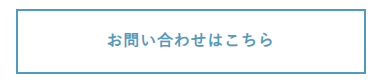
HTML
<a href="#" class="border_btn01">お問い合わせはこちら</a>CSS
.border_btn01 {
  display: inline-block;
  width: 100%;
  max-width: 350px; /* ボタン幅 */
  color: #4D9BC1; /* 文字色 */
  border: 2px solid #4D9BC1; /* 線幅・種類・色 */
  background: #fff; /* 背景色 */
  padding: 1em 2em;
  font-weight: bold; /* 文字の太さ */
  text-decoration: none;
  text-align: center;
  transition: 0.3s;
}

/* マウスオーバーした際のデザイン */
.border_btn01:hover {
  color: #fff; /* 文字色 */
  background: #4D9BC1; /* 背景色 */
}
枠線に影をつけたボタン
シンプルな白抜きの長方形の枠で、カーソルを合わせると影の位置が上下で入れ替わります。
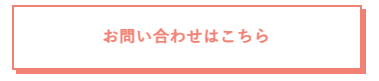
HTML
<a href="#" class="shadow_btn02">お問い合わせはこちら</a>CSS
.shadow_btn02 {
  display: inline-block;
  width: 100%;
  max-width: 350px; /* ボタン幅 */
  border: 2px solid #F38173; /* 線幅・種類・色 */
  border-radius: 0;
  color: #F38173; /* 文字色 */
  background: #fff; /* 背景色 */
  -webkit-box-shadow: 4px 4px 0 #F38173; /* 影の距離・色 */
  box-shadow: 4px 4px 0 #F38173; /* 影の距離・色 */
  padding: 1em 2em;
  font-weight: bold; /*文字の太さ*/
  text-decoration: none;
  text-align: center;
  transition: 0.3s;
}

/* マウスオーバーした際のデザイン */
.shadow_btn02:hover {
  -webkit-box-shadow: -4px -4px 0 #F38173; /* 影の距離・色 */
  box-shadow: -4px -4px 0 #F38173; /* 影の距離・色 */
}
上下の線だけのボタン
長方形の上下の線だけ表示されるボタンデザインです。カーソルを合わせると線が左右に動き、スタイリッシュな印象になります。
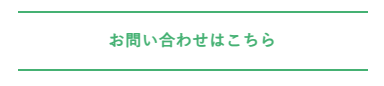
HTML
<a href="#" class="border_btn02">お問い合わせはこちら</a>CSS
.border_btn02 {
  display: inline-block;
  width: 100%;
  max-width: 350px; /* ボタン幅 */
  position: relative;
  color: #45B173; /* 文字色 */
  padding: 1em 2em;
  font-weight: bold;
  text-decoration: none;
  text-align: center;
  transition: 0.3s;
}

.border_btn02::before,
.border_btn02::after {
  position: absolute;
  width: 100%;
  height: 2px; /* 線幅 */
  content: '';
  -webkit-transition: all .3s;
  transition: all .3s;
  background: #45B173; /* 線色 */
}

.border_btn02::before {
  top: 0;
  left: 0;
}

.border_btn02::after {
  right: 0;
  bottom: 0;
}

/* マウスオーバーした際のデザイン */
.border_btn02:hover:before,
.border_btn02:hover:after {
  width: 0;
}
シンプルな枠線→点線になるボタン
見た目はベーシックな白抜きの長方形ですが、カーソルを合わせると直線が点線になります。
HTML
<a href="#" class="border_btn03">お問い合わせはこちら</a>CSS
.border_btn03 {
  display: inline-block;
  width: 100%;
  max-width: 350px; /* ボタン幅 */
  border: 2px solid #B476CE; /* 線幅・種類・色 */
  color: #B476CE; /* 文字色 */
  background: #fff; /* 背景色 */
  padding: 1em 2em;
  font-weight: bold;
  text-decoration: none;
  text-align: center;
  transition: 0.3s;
}

/* マウスオーバーした際のデザイン */
.border_btn03:hover {
  border-style: dashed;
}
二重枠線のボタン
白抜きの長方形ですが、枠がより太く強調されるため存在感が増します。
HTML
<a href="#" class="border_btn04">お問い合わせはこちら</a>CSS
.border_btn04 {
  display: inline-block;
  width: 100%;
  max-width: 350px; /* ボタン幅 */
  position: relative;
  color: #F88400; /* 文字色 */
  border: 3px solid #F88400; /* 線幅・種類・色 */
  border-radius: 0;
  background: #fff; /* 背景色 */
  padding: 1em 2em;
  font-weight: bold;
  text-decoration: none;
  text-align: center;
}

.border_btn04:before {
  position: absolute;
  top: 2px;
  left: 2px;
  width: calc(100% - 6px);
  height: calc(100% - 6px);
  content: '';
  -webkit-transition: all .3s;
  transition: all .3s;
  border: 1px solid #F88400;
}

/* マウスオーバーした際のデザイン */
.border_btn04:hover:before {
  top: 0;
  left: 0;
  width: 100%;
  height: 100%;
  content: '';
}
背景を塗りつぶしたボタン
四角く一色で塗りつぶしたボタン
長方形を塗りつぶし、白文字で表示するデザインです。カーソルを合わせると文字と塗りつぶしの色が反転します。
HTML
<a href="#" class="background_btn01">お問い合わせはこちら</a>CSS
.background_btn01 {
  display: inline-block;
  width: 100%;
  max-width: 350px; /* ボタン幅 */
  position: relative;
  background: #4D9BC1; /* 背景色 */
  border: 2px solid #4D9BC1;
  padding: 1em 2em;
  font-weight: bold;
  color: #fff; /* 文字色 */
  text-decoration: none;
  text-align: center;
  transition-duration: 0.3s;
}

.background_btn01:before {
  content: '';
  width: 8px;
  height: 8px;
  border: 0;
  border-top: 2px solid #fff; /* 矢印の色 */
  border-right: 2px solid #fff; /* 矢印の色 */
  transform: rotate(45deg);
  position: absolute;
  top: 50%;
  left: 25px;
  margin-top: -6px;
}

/* マウスオーバーした際のデザイン */
.background_btn01:hover {
  background: #fff; /* 背景色 */
  color: #4D9BC1; /* 文字色 */
}

.background_btn01:hover:before {
  border-top: 2px solid #4D9BC1; /* 矢印の色 */
  border-right: 2px solid #4D9BC1; /* 矢印の色 */
}
スライドするボタン
シンプルな塗りつぶしのデザインで、カーソルを合わせると左右方向にスライドして色が変わります。
HTML
<a href="#" class="background_btn02">お問い合わせはこちら
  <div class="background_btn02_arrow">
    <svg class="background_btn02-line" width="48" height="12" viewBox="0 0 48 12" fill="none" xmlns="http://www.w3.org/2000/svg">
      <line x1="0.5" y1="5.63672" x2="46.5" y2="5.63672" stroke="#fff" stroke-linecap="round"></line>
      <path d="M41.8633 1L46.7954 5.93209L41.8633 10.8642" stroke="#fff" stroke-linecap="round" stroke-linejoin="round"></path>
    </svg>
  </div>
</a>
CSS
.background_btn02 {
  display: inline-block;
  color: #fff; /* 文字色 */
  font-weight: bold; /* 文字の太さ */
  width: 100%;
  max-width: 350px; /* ボタン幅 */
  text-decoration: none;
  border: 2px solid #F38173; /* 線の色 */
  padding: 1em 2em;
  text-align: center;
  position: relative;
  background-repeat: no-repeat;
  background-position: 100% 0;
  background-size: 200% auto;
  background-image: linear-gradient(to right, #fff 0%, #fff 50%, #F38173 50%, #F38173 100%); /* 背景色(マウスオーバー後→前) */
  transition: background-position .8s cubic-bezier(0.19, 1, 0.22, 1);
  -webkit-transition: background-position .8s cubic-bezier(0.19, 1, 0.22, 1);
}

.background_btn02_arrow {
  display: inline-block;
  padding-left: 1em;
}

/* マウスオーバーした際のデザイン */
.background_btn02:hover {
  background-position: 0 0;
  color: #000; /* 文字色 */
}

.background_btn02:hover .background_btn02-line path ,
.background_btn02:hover .background_btn02-line line {
  stroke: #000; /* 矢印の色 */
}
並行四辺形のボタン
カーソルを合わせると並行四辺形から長方形に変わるデザインです。スポーティなイメージを出すことができます。

HTML
<a href="#" class="cta_btn06">お問い合わせはこちら</a>CSS
  .cta_btn06 {
        width: 100%;
        max-width: 350px; /* ボタン幅 */
        font-weight: 700; /* 文字の太さ */
        line-height: 1.5;
        position: relative;
        display: inline-block;
        padding: 1em 2em;
        -webkit-transition: all 0.3s;
        transition: all 0.3s;
        text-decoration: none;
        text-align: center;
        letter-spacing: 0.1em;
        color: #fff; /* 文字色 */
        -webkit-transform: skew(-15deg);
        transform: skew(-15deg);
        background-color: #45B173; /* 背景色 */
        -webkit-box-shadow: 0 5px 10px rgba(0, 0, 0, 0.1);
      }
      .cta_btn06::after {
          content: '▶';
          margin-left: 1em;
      }
枠線が大きく表示されるボタン
シンプルな塗りつぶしのボタンデザインですが、カーソルを合わせると枠が大きく表示され色が反転します。
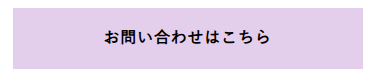
HTML
<a href="#" class="background_btn03">お問い合わせはこちら</a>CSS
.background_btn03 {
  position: relative;
  width: 100%;
  max-width: 350px; /* ボタンの幅 */
  color: #000; /* 文字色 */
  font-weight: 600;
  background:#E3CEEC; /* 背景色 */
  transition: all 0.5s;
  text-decoration: none;
  text-align: center;
  display: inline-block;
  padding: 1em 2em;
}

/* マウスオーバーした際のデザイン */
.background_btn03::after {
  content: '';
  position: absolute;
  top: 0;
  left: 0;
  width: 100%;
  height: 100%;
  transition: all 0.4s;
  border: 2px solid #B058D6; /* 枠の色 */
  transform: scale(1.5,1.5);
  opacity: 0;
  z-index: 1;
}
.background_btn03:hover {
  background: #fff; /* 背景色 */
}
.background_btn03:hover::after {
  opacity: 1;
  transform: scale(1,1);
}
丸を使ったシンプルなボタン
シンプルな丸だけのボタン
平面の丸が動くだけのシンプルなボタンデザインです。
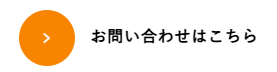
HTML
<a href="#" class="circle_btn01">
<div class="circle_btn01_arrow"><span>></span></div>
<p class="circle_btn01_txt">お問い合わせはこちら</p>
</a>CSS
.circle_btn01 {
  display: flex;
  align-items: center;
  text-decoration: none;
  color: #000; /* 文字色 */
  font-weight: bold;
  position: relative;
  width: fit-content;
  gap: 1em;
}

.circle_btn01_arrow {
  background: #F88400; /* 丸の色 */
  color: #fff; /* 矢印の色 */
  padding: 0.7em;
  border-radius: 100vh;
  width: 1.5em; /* 丸の横幅 */
  height: 1.5em; /* 丸の高さ */
  text-align: center;
  transition: 0.3s;
}

.circle_btn01_arrow span {
  position: absolute;
  top: 50%;
  left: 50%;
  transform: translate(-50%, -50%) scalex(0.55);
  -webkit-transform: translate(-50%, -50%) scalex(0.55);
  -ms-transform: translate(-50%, -50%) scalex(0.55);
}

/* マウスオーバーした際のデザイン */
.circle_btn01:hover .circle_btn01_arrow {
  transform: scale(1.15); /* 丸の大きさ */
}
丸が背景になるボタン(文字色反転)
見た目は丸だけですが、カーソルを合わせると角丸の塗りつぶしに変わり、文字色が反転します。
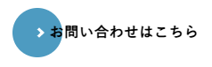
HTML
<a href="#" class="circle_btn02"><span>お問い合わせはこちら</span></a>CSS
.circle_btn02 {
  position: relative;
  display: flex;
  justify-content: space-around;
  align-items: center;
  max-width: 300px; /* ボタンの最大幅 */
  padding: 1em 2em;
  color: initial; /* 文字色 */
  transition: 0.3s ease-in-out;
  font-weight: bold;
  text-decoration: none;
}

.circle_btn02::before, .circle_btn02::after {
  content: "";
  position: absolute;
  display: block;
  top: 50%;
}

.circle_btn02::before {
  width: 0.5em;
  height: 0.5em;
  left: 1em;
  border-top: solid 2px #fff; /* 矢印の色 */
  border-right: solid 2px #fff; /* 矢印の色 */
  z-index: 2;
  transform: translateY(-50%) rotate(45deg);
  transition: all 0.3s;
}

.circle_btn02::after {
  left: 0;
  background: #4D9BC1; /* 背景色 */
  z-index: 1;
  width: 3em;
  height: 3em;
  border-radius: 3em;
  transform: translateY(-50%);
  transition: all 0.5s;
}

.circle_btn02 span {
  position: relative;
  transition: all 0.3s;
  z-index: 3;
}

/* マウスオーバーした際のデザイン */
.circle_btn02:hover span {
  color: #fff; /* 文字色 */
}

.circle_btn02:hover:before {
  left: 2rem;
}

.circle_btn02:hover:after {
  right: 0;
  width: 100%;
}
丸が背景になるボタン
カーソルを合わせると丸から角丸の塗りつぶしに変わるシンプルなボタンデザインです。
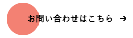
HTML
<a href="#" class="circle_btn03">
  <span>お問い合わせはこちら</span>
  <svg viewBox="0 0 13 10" height="10px" width="15px">
    <path d="M1,5 L11,5"></path>
    <polyline points="8 1 12 5 8 9"></polyline>
  </svg>
</a>
CSS
.circle_btn03 {
  position: relative;
  padding: 1em 2em;
  transition: all 0.2s ease;
  border: none;
  background: none;
  text-decoration: none;
  display: inline-block;
}

.circle_btn03:before {
  content: "";
  position: absolute;
  top: 50%;
  left: -0.5em;
  transform: translateY(-50%);
  -webkit-transform: translateY(-50%);
  -ms-transform: translateY(-50%);
  display: block;
  border-radius: 100vh;
  background: #F38173; /* 背景色 */
  width: 4em; /* 丸の横幅 */
  height: 4em; /* 丸の高さ */
  transition: all 0.3s ease;
}

.circle_btn03 span {
  position: relative;
  font-weight: 700; /* 文字の太さ */
  letter-spacing: 0.05em; /* 文字間隔 */
  color: #000; /* 文字色 */
}

.circle_btn03 svg {
  position: relative;
  top: -1px;
  margin-left: 10px;
  fill: none;
  stroke-linecap: round;
  stroke-linejoin: round;
  stroke: #000; /* 矢印の色 */
  stroke-width: 2;
  transform: translateX(-5px);
  transition: all 0.3s ease;
}

/* マウスオーバーした際のデザイン */
.circle_btn03:hover:before {
  width: calc(100% + 1em);
}

.circle_btn03:hover svg {
  transform: translateX(0);
}

.circle_btn03:active {
  transform: scale(0.95);
}
円の中に「→」があるボタン
最後の「→」の周りが円になっていて、カーソルを合わせると円が一周する動きが特徴です。
HTML
   <div class="circle_btn05">
      <a href="#" class="circle_btn05-txt">お問い合わせはこちら</a>
      <div class="circle_btn05-icon">
        <div class="circle_btn05-circle">
          <svg width="48" height="48" viewBox="0 0 48 48" fill="none" xmlns="http://www.w3.org/2000/svg">
            <mask id="644189">
              <path d="M43.7571 14.445C54.0966 36.6284 26.334 56.7459 8.47304 39.5132C-8.25498 22.2711 10.2249 -5.00596 32.2464 3.65796" stroke="#ffffff" stroke-width="2" stroke-linecap="round"></path>
            </mask>
            <foreignObject x="0" y="0" width="48" height="48" mask="url(#644189)">
              <div class="circle_btn05-circle-itm"></div><!-- 丸の色 -->
            </foreignObject>
          </svg>
        </div>
        <div class="circle_btn05-arrow">
          <svg width="16" height="13" viewBox="0 0 16 13" fill="none" xmlns="http://www.w3.org/2000/svg">
            <g>
              <path d="M0 6.5H14.6036" stroke="black" stroke-width="2" stroke-miterlimit="10"></path>
              <path d="M9.72588 11.5533L14.6036 6.5" stroke="black" stroke-width="2" stroke-miterlimit="10" stroke-linecap="square"></path>
              <path d="M9.72588 1.43652L14.6036 6.5" stroke="black" stroke-width="2" stroke-miterlimit="10" stroke-linecap="square"></path>
            </g>
          </svg>
        </div>
      </div>
      </div>
CSS
      .circle_btn05 {
        position: relative;
        display: inline-block;
      }

      .circle_btn05 .circle_btn05-txt {
        height: 48px;
        line-height: 48px;
        padding-right: 72px;
        color: initial; /* 文字色 */
        text-decoration: none;
        font-weight: bold; /* 文字の太さ */
      }

      .circle_btn05 .circle_btn05-icon {
        width: 48px;
        height: 48px;
        position: absolute;
        top: 0;
        right: 0;
        pointer-events: none;
      }

      .circle_btn05 .circle_btn05-icon .circle_btn05-circle {
        transition: transform 1s cubic-bezier(.23,1,.32,1);
        height: 48px;
      }

      .circle_btn05 .circle_btn05-icon .circle_btn05-circle svg {
        transition: transform .75s cubic-bezier(.215,.61,.355,1);
        width: 100%;
        height: 100%;
        position: relative;
      }

      .circle_btn05 .circle_btn05-icon .circle_btn05-circle svg path {
        stroke-width: 2;
        transition: stroke-width .75s cubic-bezier(.215,.61,.355,1);
      }

      .circle_btn05 .circle_btn05-icon .circle_btn05-arrow {
        position: absolute;
        top: 50%;
        left: 50%;
        transform: translate(-50%, -50%);
        -webkit-transform: translate(-50%, -50%);
        -ms-transform: translate(-50%, -50%);
        display: inline-flex;
      }

      .circle_btn05 .circle_btn05-icon .circle_btn05-arrow svg path {
        stroke-width: 2;
        stroke: #45B173; /* 矢印の色 */
      }

      .circle_btn05 .circle_btn05-circle-itm {
        background-color: #45B173; /* 丸の色 */
        height:48px;
      }

      /* マウスオーバーした際のデザイン */
      .circle_btn05:hover .circle_btn05-txt {
        transform: translateX(-12px);
        transition: transform .5s cubic-bezier(.39,.575,.565,1);
      }

      .circle_btn05:hover .circle_btn05-icon .circle_btn05-circle {
        transform: rotate(1turn);
        transition: transform .75s cubic-bezier(.23,1,.32,1);
      }

      .circle_btn05:hover .circle_btn05-icon .circle_btn05-circle svg {
        transform: scale(1.5);
      }
文字と丸の色が動くボタン
カーソルを合わせると文字が動き、丸の色が変わるシンプルなボタンデザインです。
HTML
<div class="circle_btn06" data-scroll-trigger="js-scroll-to-top">
<a href="#" class="circle_btn06-arrow">
  <span class="circle_btn06-arrow_str" data-btn-links="" data-str="お問い合わせはこちら">
    <span data-btn-links-str="">お問い合わせはこちら</span>
  </span>
  <span class="circle_btn06-arrow_circle">
    <svg width="15" height="10" viewBox="0 0 15 10" fill="none" xmlns="http://www.w3.org/2000/svg">
      <path d="M10.6955 4.56285L7.71881 2.35717L8.79613 1.11108L13.8461 5.55583L8.79613 9.99997L7.71881 8.75207L10.6955 6.54639H1.15384V4.56285H10.6955Z" fill="white"></path>
    </svg>
  </span>
</a>
</div>
CSS
.circle_btn06 {
  margin: 0.5em auto;
  max-width: fit-content;
}

.circle_btn06-arrow {
  color: initial; /* 文字色 */
  font-weight: bold; /* 文字の太さ */
  display: inline-flex;
  position: relative;
  padding-right: 65px;
  padding-left: 0;
  box-shadow: none;
}

.circle_btn06-arrow [data-btn-links] {
  display: inline-block;
  position: relative;
  overflow: hidden;
}

.circle_btn06-arrow [data-btn-links]:before {
  speak: none;
  position: absolute;
  bottom: 0;
  left: 0;
  transform: translateY(180%) skewY(10deg);
  content: attr(data-str);
  transition: all .5s cubic-bezier(.19,1,.22,1);
  transition-property: transform;
  transition-timing-function: cubic-bezier(.19,1,.22,1);
  will-change: transform;
}

.circle_btn06-arrow [data-btn-links] [data-btn-links-str] {
  display: inline-block;
  transition: all .3s cubic-bezier(.19,1,.22,1);
  transition-property: transform;
  transition-timing-function: cubic-bezier(.19,1,.22,1);
  will-change: transform;
}

.circle_btn06-arrow [data-btn-links]:after {
  position: absolute;
  bottom: 0;
  left: 0;
  width: 100%;
  height: 1px;
  transform-origin: right center;
  content: "";
  transition: all .6s cubic-bezier(1,0,0,1);
  transition-property: transform;
  transition-timing-function: cubic-bezier(1,0,0,1);
}

.circle_btn06-arrow .circle_btn06-arrow_circle {
  display: flex;
  position: absolute;
  top: 50%;
  right: 0;
  align-items: center;
  justify-content: center;
  width: 50px;
  height: 50px;
  overflow: hidden;
  transform: translateY(-50%);
  border-radius: 50px;
}

.circle_btn06-arrow .circle_btn06-arrow_circle:before {
  z-index: 1;
  position: absolute;
  top: 0;
  left: 0;
  width: 100%;
  height: 100%;
  border-radius: 0px;
  background-color: #B476CE; /* 丸の色 */
  content: "";
  will-change: transform;
}

.circle_btn06-arrow .circle_btn06-arrow_circle svg {
  z-index: 3;
  position: relative;
}

.circle_btn06-arrow .circle_btn06-arrow_circle:after {
  z-index: 2;
  position: absolute;
  top: 0;
  left: 0;
  width: 200%;
  height: 200%;
  transform: translate(-25%,-100%);
  border-radius: 200px;
  background-color: #344a63; /* マウスオーバー時丸の色 */
  content: "";
  transition: all .4s cubic-bezier(1,0,0,1);
  transition-timing-function: cubic-bezier(1,0,0,1);
  will-change: transform;
}

/* マウスオーバーした際のデザイン */
.circle_btn06-arrow:hover {
  color: #212529; /* 文字色 */
  text-decoration: none;
}

.circle_btn06-arrow:active [data-btn-links]:before, .circle_btn06-arrow:focus [data-btn-links]:before, .circle_btn06-arrow:hover [data-btn-links]:before {
  transform: translateY(0);
}

.circle_btn06-arrow:active [data-btn-links] [data-btn-links-str], .circle_btn06-arrow:focus [data-btn-links] [data-btn-links-str], .circle_btn06-arrow:hover [data-btn-links] [data-btn-links-str] {
  transform: translateY(-180%) skewY(-10deg);
}

.circle_btn06-arrow:active [data-btn-links]:after, .circle_btn06-arrow:focus [data-btn-links]:after, .circle_btn06-arrow:hover [data-btn-links]:after {
  transform: scaleX(0);
}

.circle_btn06-arrow:active .circle_btn06-arrow_circle:after, .circle_btn06-arrow:focus .circle_btn06-arrow_circle:after, .circle_btn06-arrow:hover .circle_btn06-arrow_circle:after {
  -webkit-animation: btn-circle-in .4s cubic-bezier(.19,1,.22,1) 0s;
  transform: translate(-25%);
  border-radius: 50px;
  animation: btn-circle-in .4s cubic-bezier(.19,1,.22,1) 0s;
}
円から丸に変わるボタン
カーソルを合わせると円から丸になり、文字にも動きがつくボタンデザインです。
HTML
<a href="#" class="circle_btn08">
  <div class="circle_btn08_box">
    <span data-text="お">お</span>
    <span data-text="問">問</span>
    <span data-text="い">い</span>
    <span data-text="合">合</span>
    <span data-text="わ">わ</span>
    <span data-text="せ">せ</span>
    <span data-text="は">は</span>
    <span data-text="こ">こ</span>
    <span data-text="ち">ち</span>
    <span data-text="ら">ら</span>
  </div>
</a>
CSS
.circle_btn08 {
  text-decoration: unset;
  position: relative;
  display: inline-block;
  padding-left: 48px;
  box-sizing: border-box;
  line-height: 1.2;
  font-weight: 500;
  transition: padding-right .6s cubic-bezier(.25,1,.5,1);
}
.circle_btn08:before {
  content: "";
  width: 32px;
  height: 32px;
  position: absolute;
  box-sizing: border-box;
  left: 0;
  top: 45%;
  transform-origin: center center;
  transform: translateY(-50%);
  border-radius: 50%;
  border: solid 7px #F88400; /* 円の色 */
  transition: width .4s cubic-bezier(.25,1,.5,1);
  transition-property: width,height,left;
}
.circle_btn08_box {
  position: relative;
  overflow: hidden;
  color: #F88400; /* 文字の色 */
  display: table;
  font-weight: bold; /* 文字の大きさ */
}
.circle_btn08 span {
  position: relative;
  display: inline-block;
  transition: transform 1s cubic-bezier(.25,1,.5,1);
}
.circle_btn08 span:after {
  content: attr(data-text);
  position: absolute;
  top: 1.5em;
  left: 0;
}

/* ↓文字の下図に合わせて調整する */
.circle_btn08 span:nth-child(1) {
  transition-delay: 0.02s;
}
.circle_btn08 span:nth-child(2) {
  transition-delay: .04s;
}
.circle_btn08 span:nth-child(3) {
  transition-delay: .06s;
}
.circle_btn08 span:nth-child(4) {
  transition-delay: .08s;
}
.circle_btn08 span:nth-child(5) {
  transition-delay: .1s;
}
.circle_btn08 span:nth-child(6) {
  transition-delay: .12s;
}
.circle_btn08 span:nth-child(7) {
  transition-delay: .14s;
}
.circle_btn08 span:nth-child(8) {
  transition-delay: .16s;
}
.circle_btn08 span:nth-child(9) {
  transition-delay: .18s;
}
.circle_btn08 span:nth-child(10) {
  transition-delay: .2s;
}

/* マウスオーバーした際のデザイン */
.circle_btn08:hover:before {
  width: 14px;
  height: 14px;
  left: 8px;
}
.circle_btn08:hover span {
  transform: translateY(-1.5em);
}
3Dのボタン
立体的な影付きの四角ボタン
薄い影を付けることで、少し浮かび上がったような印象になります。
HTML
<a href="#" class="shadow_btn01"><span>お問い合わせはこちら</span></a>CSS
.shadow_btn01 {
  display: flex;
  justify-content: center;
  align-items: center;
  width: 100%;
  max-width: 350px; /* ボタン幅 */
  height: 3.5em; /* ボタン高さ */
  background: #fff; /* 背景色 */
  position: relative;
}

.shadow_btn01 span {
  display: flex;
  justify-content: center;
  align-items: center;
  width: 100%;
  height: 3.5em;
  background: #fff; /* 背景色 */
  color: #000; /* 文字色 */
  font-weight: bold; /* 文字の太さ */
  letter-spacing: 0.1em;
  text-decoration: none;
  box-shadow: 0px 5px 12px #cad4e2, -6px -6px 12px #fff;
  border-radius: 10px;
  position: absolute;
  top: -5px;
  left: 0;
  transition-duration: 0.2s;
}

/* マウスオーバーした際のデザイン */
.shadow_btn01:hover span {
  left: 0;
  top: 0;
  box-shadow: 0 0 4px #CAD4E2, -2px -2px 4px #FFF;
}
角丸で影付きのボタン
濃い影がついていて、カーソルを合わせると塗りつぶしの色が濃くなるため、存在感があるボタンです。
HTML
<a href="#" class="border_btn08"><span>お問い合わせはこちら</span></a>CSS
.border_btn08 {
  position: relative;
  text-decoration: none;
  display: inline-block;
  text-align: center;
  width: 100%;
  max-width: 350px; /* ボタンの最大幅 */
}

.border_btn08::before {
  content: "";
  position: absolute;
  z-index: -1;
  top: 4px;
  left: 4px;
  width: 100%;
  height: 100%;
  -moz-border-radius: 100vh;
  -webkit-border-radius: 100vh;
  border-radius: 100vh;
  background-color: #4D9BC1; /* 後ろの背景色 */
}

.border_btn08 span {
  position: relative;
  z-index: 2;
  display: flex;
  flex-direction: column;
  justify-content: center;
  font-weight: bold; /* 文字の太さ */
  border-radius: 100vh;
  border: solid 1px #4D9BC1; /* 線の色 */
  color: #4D9BC1; /* 文字色 */
  padding: 1em 2em;
  background-color: #FFF; /* 背景色 */
  -moz-transition: all 0.2s ease-in-out;
  -o-transition: all 0.2s ease-in-out;
  -webkit-transition: all 0.2s ease-in-out;
  transition: all 0.2s ease-in-out;
}

/* マウスオーバーした際のデザイン */
.border_btn08:hover span {
  background-color: #FFFF00; /* 背景色 */
  transform: translate(4px, 4px);
  transition: all 0.3s ease-in-out;
}
ポップな立体的ボタン
カーソルを合わせるとボタンが押されるアクションがあるポップな印象のボタンデザインです。
HTML
<a href="#" class="cta_btn01">
  <span class="cta_btn01-front">お問い合わせ</span>
</a>
CSS
.cta_btn01 {
  width: 100%;
  max-width: 350px; /* ボタン幅 */
  font-weight: bold; /* 文字の太さ */
  line-height: 1.5;
  position: relative;
  display: inline-block;
  transition: all 0.3s;
  text-align: center;
  vertical-align: middle;
  text-decoration: none;
  letter-spacing: 0.1em;
  color: #000; /* 文字色 */
  border-radius: 0.5rem;
  margin-bottom: 0.5rem;
  padding: 0;
}

.cta_btn01:before {
  position: absolute;
  top: -5px;
  right: 0;
  bottom: 0;
  left: 0;
  height: 100%;
  content: "";
  transition: all 0.3s;
  transform: translate3d(0, 0.75rem, -1rem);
  border: 2px solid #000;
  border-radius: inherit;
  background: #F38173; /* ボタン下色 */
  box-shadow: 0 0.6rem 0 0 rgba(0, 0, 0, 0.2);
}

.cta_btn01-front {
  position: relative;
  display: block;
  padding: 0.7em 2em;
  transition: all 0.3s;
  border: 2px solid #000;
  border-radius: inherit;
  background: #fff; /* ボタン上色 */
}

/* マウスオーバーした際のデザイン */
.cta_btn01:hover {
  -webkit-transform: translate(0, 0.25rem);
  transform: translate(0, 0.25rem);
  background: #fff100;
}

.cta_btn01:hover:before {
  transform: translate3d(0, 0.5rem, -1rem);
  box-shadow: 0 0.35rem 0 0 rgba(0, 0, 0, 0.2);
}
光沢のあるボタン
濃淡のある塗りつぶしで、光沢を感じるボタンデザインです。
HTML
<a href="#" class="cta_btn07">お問い合わせはこちら</i></a>CSS
.cta_btn07 {
  display: inline-block;
  width: 100%;
  max-width: 350px; /* ボタン幅 */
  font-weight: bold; /* ボタンの太さ */
  padding: 1em 2em;
  color: #fff;
  border-radius: 100vh;
  background: #014E22; /* ボタン背景色 */
  background: linear-gradient(0deg, #014E22 50%, #45B173 100%); /* ボタン背景色(グラデーション) */
  box-shadow: inset 0 1px 1px rgba(255, 255, 255, .6), 0 5px 10px rgba(0, 0, 0, .1);
  text-decoration: none;
  text-align: center;
  transition: 0.3s;
}

/* マウスオーバーした際のデザイン */
.cta_btn07:hover {
  background: linear-gradient(0deg, #249455 20%, #014E22 100%);
  -webkit-box-shadow: 0 2px 3px rgb(0 0 0 / 10%);
  box-shadow: 0 2px 3px rgb(0 0 0 / 10%);
}
左上の角がめくれる四角ボタン
シンプルな影のついた長方形のボタンですが、カーソルを合わせると左端が少しめくれるボタンデザインです。
HTML
<a href="#" class="background_btn04">お問い合わせはこちら</a>CSS
.background_btn04 {
  position: relative;
  display: inline-block;
  width: 100%;
  max-width: 350px; /* ボタン幅 */
  padding: 1em 2em;
  background: #B476CE; /* 背景色 */
  text-decoration: none;
  border-radius: 0.5em;
  color: #fff; /* 文字色 */
  box-shadow: 0.5em 0.5em 0.5em rgba(0, 0, 0, 0.2);
  font-weight: bold;
  text-align: center; /* 文字の太さ */
}

/* マウスオーバーした際のデザイン */
.background_btn04::before {
  position: absolute;
  content: '';
  height: 0;
  width: 0;
  top: 0;
  left: 0;
  background: linear-gradient(135deg, rgb(255 255 255) 0%, rgb(255 255 255) 50%, #B476CE 50%, #B476CE 60%); /* めくれた色 */
  border-radius: 0 0 0.5em 0;
  box-shadow: 0.2em 0.2em 0.2em rgba(0, 0, 0, 0.3);
  transition: 0.3s;
}
.background_btn04:hover::before {
  width: 2em;
  height: 2em;
}

/* クリックした際のデザイン */
.background_btn04:active {
  box-shadow: 0.2em 0.2em 0.3em rgba(0, 0, 0, 0.3);
  transform: translate(1px, 1px);
}
光るボタン
下に動く四角ボタン
何もしなくても、キラッと光る動きが表示されるボタンデザインです。カーソルを合わせると枠が下に動きます。
HTML
<a href="#" class="shiny_btn01">お問い合わせはこちら</a>CSS
.shiny_btn01 {
  display: inline-block;
  position: relative;
  width: 100%;
  max-width: 350px; /* ボタン幅 */
  padding: 1em 2em;
  background-color: #F88400; /* 背景色 */
  box-shadow: 0 3px 0 0 #995100; /* 影の色 */
  border-radius: 10px;
  font-weight: bold; /* 文字の太さ */
  color: #fff; /* 文字の色 */
  text-align: center;
  text-decoration: none;
  overflow: hidden;
  transition: 0.3s;
}
.shiny_btn01::before {
  position: absolute;
  content: '';
  display: inline-block;
  top: -180px;
  left: 0;
  width: 30px;
  height: 100%;
  background-color: #fff;
  transition: 0.2s;
  animation: shiny_btn01 3s ease-in-out infinite;
}

/* マウスオーバーした際のデザイン */
.shiny_btn01:hover {
  text-decoration: none;
  color: #fff;
  box-shadow: none;
  -webkit-transform: translateY(3px);
}

/* 光るアニメーション */
@-webkit-keyframes shiny_btn01 {
  0% { -webkit-transform: scale(0) rotate(45deg); opacity: 0; }
  80% { -webkit-transform: scale(0) rotate(45deg); opacity: 0.5; }
  81% { -webkit-transform: scale(4) rotate(45deg); opacity: 1; }
  100% { -webkit-transform: scale(50) rotate(45deg); opacity: 0; }
}
ゆっくり光るボタン
濃い塗りつぶしに明るい色が重なり、反射しているようにゆっくりと光るボタンデザインです。
HTML
<a href="#" class="shiny_btn02">お問い合わせはこちら</a>CSS
.shiny_btn02 {
  display: inline-block;
  color: #fff; /* 文字色 */
  padding: 1em 2em;
  width: 100%;
  max-width: 350px; /* ボタン幅 */
  font-weight: bold;
  text-decoration: none;
  border-radius: 10px;
  background: #4D9BC1; /* 背景色 */
  background-image: -webkit-linear-gradient(top, #4D9BC1, #0e5375); /* グラデーション背景色 */
  background-image: -moz-linear-gradient(top, #4D9BC1, #0e5375); /* グラデーション背景色 */
  background-image: -ms-linear-gradient(top, #4D9BC1, #0e5375); /* グラデーション背景色 */
  background-image: -o-linear-gradient(top, #4D9BC1, #0e5375); /* グラデーション背景色 */
  background-image: -webkit-gradient(to bottom, #4D9BC1, #0e5375); /* グラデーション背景色 */
  overflow: hidden;
  position: relative;
  text-align: center;
}
.shiny_btn02::before {
  position: absolute;
  content: '';
  display: inline-block;
  top: -180px;
  left: 0;
  width: 30px;
  height: 100%;
  background-color: #fff;
  animation: shiny_btn02 3s ease-in-out infinite;
  transform-origin: unset;
}

/* マウスオーバーした際のデザイン */
.shiny_btn02:hover {
  background-image: -webkit-linear-gradient(top, #0e5375, #4D9BC1); /* グラデーション背景色 */
  background-image: -moz-linear-gradient(top, #0e5375, #4D9BC1); /* グラデーション背景色 */
  background-image: -ms-linear-gradient(top, #0e5375, #4D9BC1); /* グラデーション背景色 */
  background-image: -o-linear-gradient(top, #0e5375, #4D9BC1); /* グラデーション背景色 */
  background-image: -webkit-gradient(to bottom, #0e5375, #4D9BC1); /* グラデーション背景色 */
  color: #fff;
}

/* 光るアニメーション */
@-webkit-keyframes shiny_btn02 {
  0% { -webkit-transform: scale(0) rotate(45deg); opacity: 0; }
  80% { -webkit-transform: scale(0) rotate(45deg); opacity: 0.5; }
  81% { -webkit-transform: scale(4) rotate(45deg); opacity: 1; }
  100% { -webkit-transform: scale(50) rotate(45deg); opacity: 0; }
}
コメント付きのボタン
シンプルなコメント付きのボタン
「お問い合わせ」「資料請求」といったボタンの文字の上に、ちょっとしたコメントを表示できます。
HTML
<div class="btn-design-box u-mb50">
  <a class="cta_btn04">
    <p class="cta_btn04_copy">30秒でカンタン入力!</p>
    <p>お問い合わせはこちら</p>
  </a>
</div>
CSS
.cta_btn04 {
  font-weight: bold; /* 文字の太さ */
  width: 100%;
  max-width: 350px; /* ボタン幅 */
  display: inline-block;
  padding: 1em;
  transition: 0.3s;
  text-decoration: none;
  letter-spacing: 0.1em;
  color: #fff; /* ボタン文字色 */
  border-radius: 10px;
  background: #F38173; /* 背景色 */
  box-shadow: 0 5px 0 #b84131;
  text-align: center;
}

.cta_btn04 p {
  margin: 0;
}

.cta_btn04 .cta_btn04_copy {
  font-size: 80%; /* コピー文字サイズ */
  display: block;
  padding: 0.3em 0;
  color: #b84131; /* コピー文字色 */
  border-radius: 100vh;
  background: #fff; /* コピー背景色 */
  margin-bottom: 10px;
}

/* マウスオーバーした際のデザイン */
.cta_btn04:hover {
  transform: translate(0, 3px);
  color: #fff;
  background: #F38173;
  box-shadow: 0 2px 0 #b84131;
}
吹き出しでコメントが付いたボタン
コメント部分が吹き出しになっていて単語やアイコンを入れることができるデザインです。
HTML
<a href="#" class="cta_btn05">
  <p class="cta_btn05_copy">Webで</p>
  <p>お問い合わせはこちら</p>
</a>
CSS
.cta_btn05 {
  font-weight: bold; /* 文字の太さ */
  line-height: 1.5;
  position: relative;
  display: inline-block;
  padding: 1em 2em 1em calc(5em - 15px);
  transition: 0.3s;
  text-decoration: none;
  color: #fff; /* 文字色 */
  border-radius: 0.5rem;
  background: #45B173; /* 背景色 */
  box-shadow: 0 5px 0 #19934e;
  margin-left: 10px;
}

.cta_btn05 p {
  margin: 0;
}

.cta_btn05 .cta_btn05_copy {
  position: absolute;
  bottom: 0.5em;
  left: -10px;
  display: inline-block;
  width: 5em;
  height: 5em;
  line-height: 5em;
  text-align: center;
  color: #45B173;
  font-size: 80%;
  font-weight: bold;
  background: #fff;
  border: 3px solid #45B173;
  border-radius: 50%;
  box-sizing: border-box;
  transform: rotate(-10deg);
}

.cta_btn05 .cta_btn05_copy::before {
  position: absolute;
  content: "";
  bottom: -5px;
  right: -10px;
  border: 9px solid transparent;
  border-left: 15px solid #FFF;
  z-index: 0;
  transform: rotate(45deg);
}

/* マウスオーバーした際のデザイン */
.cta_btn05:hover {
  transform: translate(0, 3px);
  background: #45B173; /* 背景色 */
  box-shadow: 0 2px 0 #19934e;
}
ボタンと離してコメントを付けたボタン
コメントをボタンの枠に重ねずに表示できます。
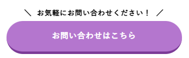
HTML
<a class="cta_btn03">
  <span class="cta_btn03-copy">お気軽にお問い合わせください!</span>
  お問い合わせはこちら
</a>
CSS
.cta_btn03 {
  width: 100%;
  max-width: 350px; /* ボタン幅 */
  color: #fff; /* ボタン文字色 */
  background-color: #B476CE; /* ボタン上色 */
  position: relative;
  padding: 1em 2em;
  border-radius: 100vh;
  border-bottom: 5px solid #7c3b97; /* ボタン下色 */
  font-weight: bold; /* ボタン文字の太さ */
  text-decoration: none;
  display: inline-block;
  transition: 0.2s;
  text-align: center;
  margin-top: 2em;
}

.cta_btn03-copy {
  font-size:90%; /* コピー文字サイズ */
  font-weight: bold; /* コピー文字の太さ */
  color: initial; /* コピー文字の色 */
  position: absolute;
  top: -2em;
  left: 50%;
  transform: translateX(-50%);
  -webkit-transform: translateX(-50%);
  -ms-transform: translateX(-50%);
  width: 100%;
}

.cta_btn03-copy:before {
  margin-right: 1rem;
  content: '\';
}

.cta_btn03-copy:after {
  margin-left: 1rem;
  content: '/';
}

/* マウスオーバーした際のデザイン */
.cta_btn03:hover {
  margin-top: calc(2em + 3px);
  border-bottom: 2px solid #7c3b97; /* ボタン下色 */
}
CTAボタン
メールと電話をセットにしたボタン
お問い合わせのメールと電話、それぞれのボタンを2つセットで横並びに表示できます。

HTML
<div class="cta_btn09">
  <a href="#" class="cta_btn09-contact">
    お問い合わせはこちら<br>
    <span class="copy_txt">お問い合わせページへ</span>
  </a>
  <a href="tel:0120-XXX-XXX" class="cta_btn09-tel">
    お電話でのご予約はこちら<br>
    <span class="copy_txt">TEL:0120-XXX-XXX</span>
  </a>
</div>
CSS
.cta_btn09 {
  font-weight: bold; /* 文字の太さ */
  text-align: center;
  letter-spacing: 0.1em;
  align-items: center;
  display: flex;
  justify-content: center;
  gap: 20px;
  flex-wrap: wrap;
}

.cta_btn09-contact , .cta_btn09-tel {
  color: #fff; /* 文字色 */
  position: relative;
  display: inline-block;
  text-decoration: none;
  padding: 1em 1em 1em 60px;
  border-radius: 100vh;
  width: 100%; /* ボタン幅 */
  max-width: 350px; /* 最低ボタン幅 */
  transition: 0.3s;
}

.cta_btn09-contact {
  background: #F88400; /* お問い合わせボタン色 */
}

.cta_btn09-tel {
  background: #4D9BC1; /* 電話ボタン色 */
}

.cta_btn09-contact::before,
.cta_btn09-tel::before {
  content: '';
  position: absolute;
  left: 30px;
  top: 50%;
  transform: translateY(-50%);
  -webkit-transform: translateY(-50%);
  -ms-transform: translateY(-50%);
  background-repeat: no-repeat;
  background-size: cover;
}
.cta_btn09-contact::before {
  width: 50px;
  height: 41px;
  background-image: url(https://seotimes.jp/wp-content/uploads/mail.png); /* メールアイコン */
}

.cta_btn09-tel::before {
  width: 40px;
  height: 40px;
  background-image: url(https://seotimes.jp/wp-content/uploads/cta-phone.png); /* 電話アイコン */
}

.cta_btn09 .copy_txt {
  line-height: 1;
  display: inline-block;
  padding: 0.2em 1.5em;
  letter-spacing: 0;
  background: #fff; /* 下文字背景色 */
  font-size: 90%; /* 下文字サイズ */
  border-radius: 5px;
}

.cta_btn09-contact .copy_txt {
  color: #F88400; /* 下文字色 */
}

.cta_btn09-tel .copy_txt {
  color: #4D9BC1; /* 下文字色 */
}

.cta_btn09 img {
    width: 1em;
    margin-right: 0.5em;
}

/* マウスオーバーした際のデザイン */
.cta_btn09-contact:hover,
.cta_btn09-tel:hover {
  transform: scale(1.05);
}
ページスクロールに応じて表示されるボタン
追従型のCTAボタンで、ページをスクロールしても画面上に表示できます。
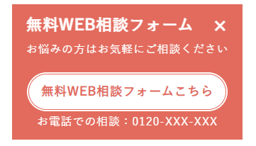
HTML
<div class="cta_btn10">
  <details open="">
    <summary>無料WEB相談フォーム</summary>
    <div class="hide">
      <div class="cta_btn10_box">
        <p class="cta_btn10_box-txt">お悩みの方はお気軽にご相談ください</p>
        <div class="cta_btn10_link">
          <a href="/contact/">無料WEB相談フォームこちら</a>
        </div>
          <p>お電話での相談 <i class="fas fa-phone"></i>0120-XXX-XXX</p>
      </div>
    </div>
  </details>
</div>
CSS
.cta_btn10 summary {
  cursor: pointer;
}
.cta_btn10 details {
  padding: 10px 20px;
  position: fixed;
  right: 0; /* 固定する場所 */
  bottom: 0; /* 固定する場所 */
  background: #E26B5D; /* 背景色 */
  color: #fff; /* 文字色 */
  z-index: 999;
}

.cta_btn10 summary {
  list-style: none;
  position: relative;
  cursor: pointer;
  padding-right: 2em;
  font-size: 140%; /* 文字サイズ */
  font-weight: bold; /* 文字太さ */
}

.cta_btn10 summary::-webkit-details-marker {
  display: none;
}

.cta_btn10 summary::after {
  content: '+';
  position: absolute;
  top: 50%;
  right: 0;
  transform: translateY(-50%);
  transition: transform 0.5s;
  font-size: 30px;
}

.cta_btn10 details[open] summary::after {
  transform: translateY(-50%) rotate(45deg);
}

.cta_btn10_box {
  text-align: center;
}

.cta_btn10_link a {
  display: block;
  color: #E26B5D; /* リンク文字色 */
  background: #fff; /* リンク背景色 */
  padding: 0.5em;
  font-size: 110%; /* リンク文字サイズ */
  font-weight: bold;
  text-decoration: none;
  border-radius: 100vh; /* 角丸 */
  border: 4px double #E26B5D; /* 線の太さ 種類 色 */
  transition: 0.5s;
}

/* マウスオーバーした際のデザイン */
.cta_btn10_link a:hover {
    opacity: 0.8;
}
よくある質問
-
ボタンは画像じゃダメなんですか?
-
画像でも表示させることは可能です。しかし、データが軽い・拡張性がある・解像度の心配がない・簡単といったメリットがあるため、CSSの活用がおすすめです。
-
ボタンデザインのポイントは?
-
以下のポイントを意識しましょう。
- わかりやすいデザインにする
- 余白と文字サイズを意識する
- 見やすい配置、クリックしやすい大きさにする
コピペで使えるデザインサンプル一覧
SEOタイムズではボタンリンクデザインのほかにも、見出しや文字装飾、画像加工のデザインを紹介しています。
コピペで使えるデザインを豊富に紹介していますので、ぜひご覧ください!
まとめ
この記事では、ボタンデザインのポイントや、実際のデザインを紹介しました。
ボタンデザインは、コンバージョンにも影響する重要な要素の1つです。デザイン性はもちろんのこと、ユーザーの使いやすさも考慮したデザインで設置するようにしましょう。
ボタンデザインに悩んだら、この記事で紹介したデザインもぜひ参考にしてみてください。
シンプルなデザインですので、様々なWebサイトにご活用いただけます。